Design Language
TabDiary's visual identity is built to feel professional and trustworthy first, distinctive second — deliberately different from the neutral, note-taking look of its sibling product Markpad.
Logo
An indigo squircle holds three stacked cards — a saved session's tabs — with a check-mark badge signaling data that's been safely kept. The badge is the whole differentiator, drawn as a shape.

Keep clear space around the mark equal to at least the badge's own radius. Don't recolor the gradient or flatten the stacked-card shading — both carry meaning (a session; data kept safe).
Color
Indigo is the brand accent — chosen specifically to differ from Markpad's neutral warm-stone palette. Emerald is reserved for "safe / reliable" states (the trash-restore icon, the sync badge), so it always means the same thing wherever it appears.
Typography
TabDiary uses the operating system's own UI font (-apple-system, "Segoe UI", sans-serif) rather than a custom webface — a session manager should feel like part of the browser, not a separate app announcing itself.
This site uses the same font, for the same reason. It previously set headings in Sora on an IBM Plex Sans body, loaded from Google Fonts. That was wrong twice over: it made the page look like a different product than the one it was selling, and it meant a page promising "no third-party scripts" was issuing a request to a third party to render its own text. Both problems have the same fix.
The size scale is deliberately short. Inside the extension it is four sizes, each with one job — 18px headings, 14px primary content, 12px secondary text, and 10px reserved for text inside a fixed circle or pill. This site adds two display sizes for page and section headings and nothing else; where hierarchy is still needed between items of the same size, colour and weight carry it rather than a fifth size. Labels and version tags use the system monospace stack (ui-monospace, SFMono-Regular, Menlo, Consolas).
Radius & elevation scale
Three consistent radii and three shadow depths are reused everywhere in the product — nothing is a one-off value.
| Token | Value | Used for |
|---|---|---|
--radius-control | 0.5rem | Buttons, inputs, small pills |
--radius-card | 0.75rem | Session & folder cards, list rows |
--radius-hero | 1rem | Modals, the delete-confirmation dialog |
--shadow-soft-sm | 1–3px blur | Resting card elevation |
--shadow-soft-md | 6–12px blur | Hover state, open dropdown panels |
--shadow-soft-lg | 10–32px blur | Modals |
The 5-level brightness scale
Rather than a binary light/dark switch, every surface color in the extension is a CSS custom property with 5 predefined values, so the brightness slider can land on any step in between — not just two extremes.
Optional interactive backgrounds
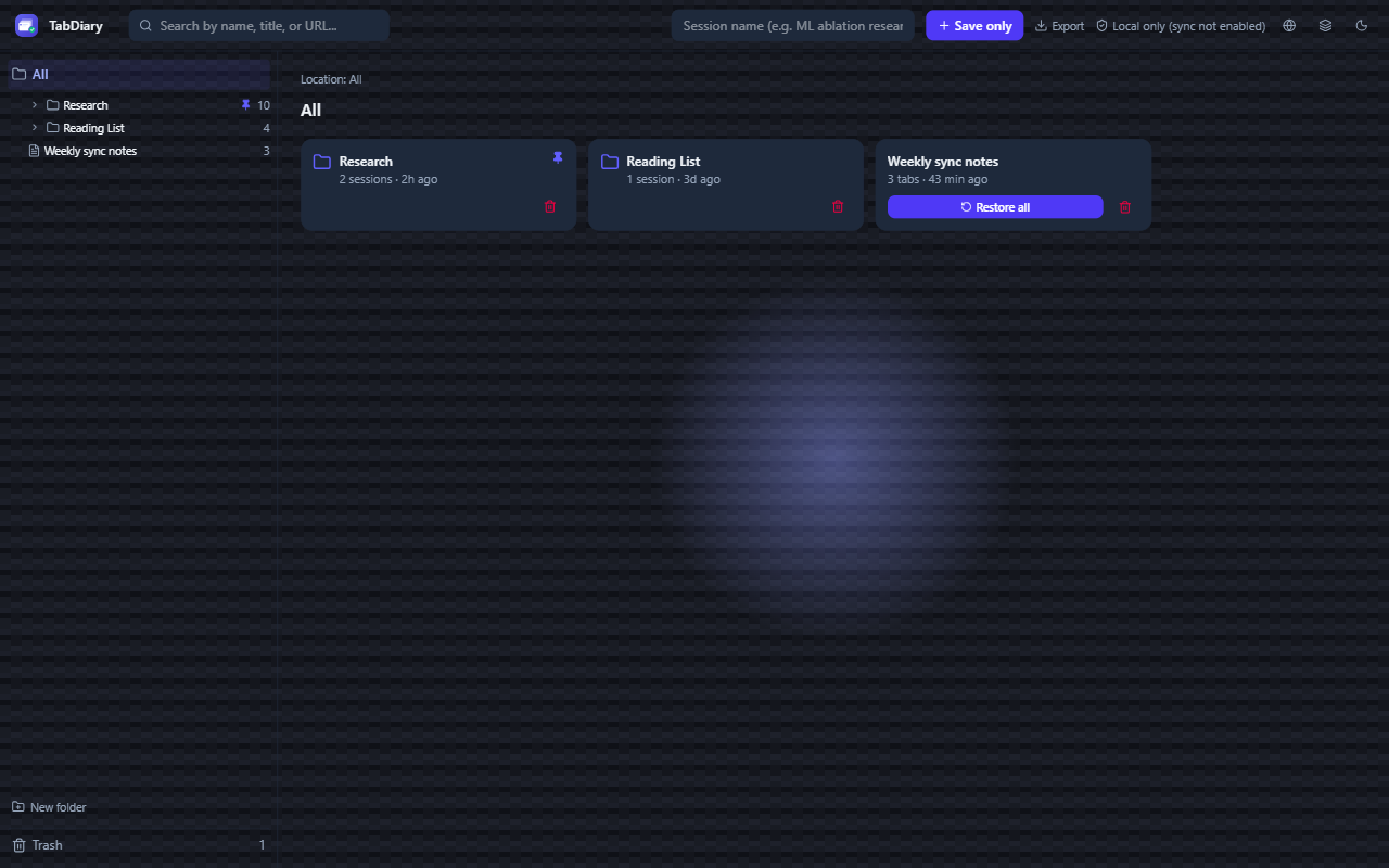
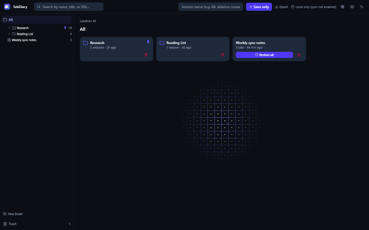
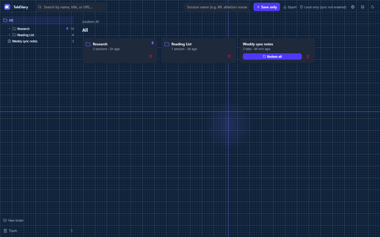
Four background styles, all opt-in and off by default, all built from pure CSS gradients and masks — no images, negligible cost when idle. Each reacts to the cursor except Aurora Glow, which is purely ambient by design.
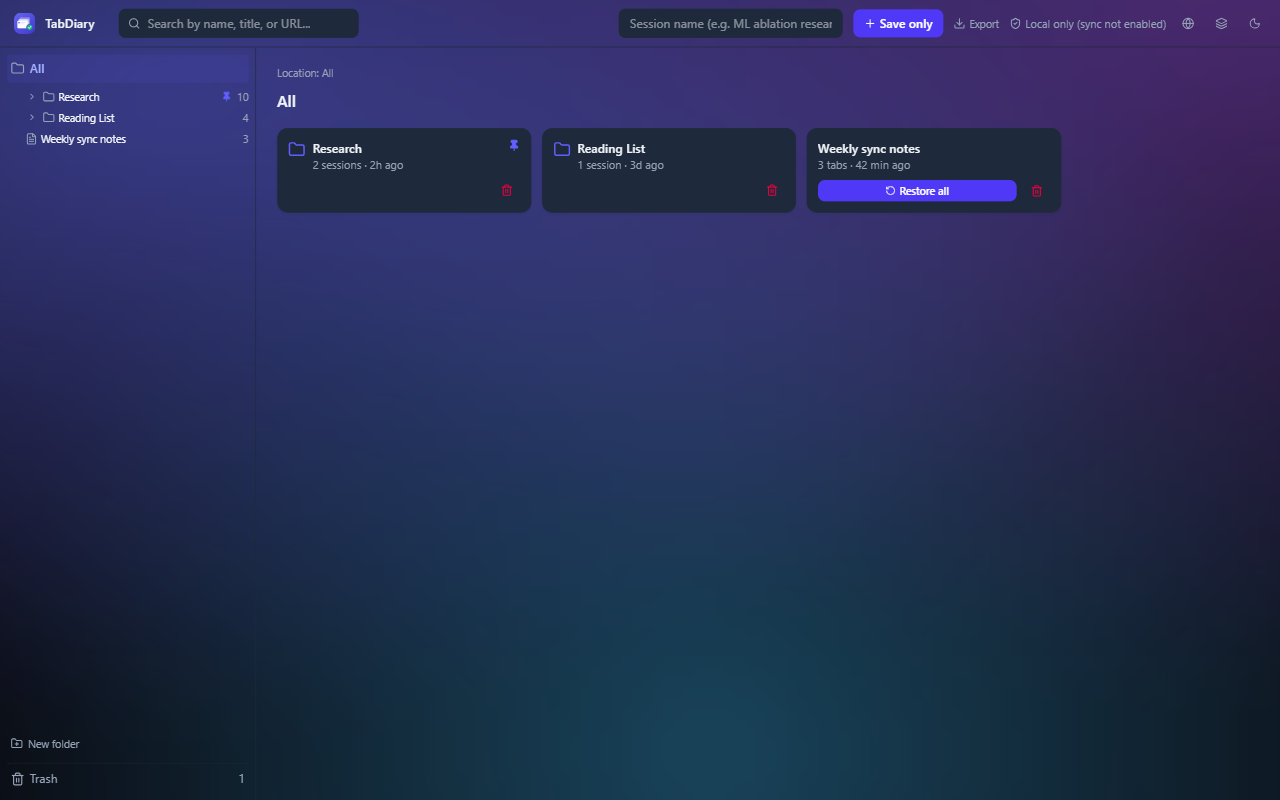
Differentiator, expressed visually
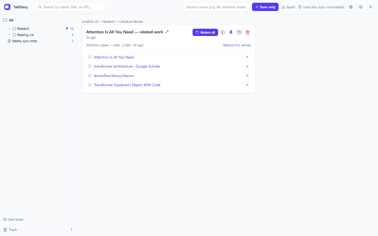
Version history and Trash aren't just features — they're the visual proof of TabDiary's core promise. The screenshot below is used deliberately as the lead image across the Chrome Web Store listing and this site's homepage, because it's the one thing a screenshot can prove that a features list can't.